Monday 27 August 2012

Post 6: Arnish Kapoor Sculpture

1.Research Kapoor's work in order to discuss whether it is conceptual art or not. Explain your answer, using a definition of conceptual art.

Conceptual Art is about the idea. The idea or the concept behind the work is the most important aspect. It means that all of the decisions and planning are made beforehand and the execution is a perfunctory affair. I think that Kapoors work would be classed as conceptual art. To me her work is a mix between architecture and sculpture, she creates large structures of undefinable shapes giving them new meaning and portraying them in unique ways. A lot of planning and pre decisions would have to have been made and highly thought through to make any of her work succeed. I do believe it is conceptual. 

"art that is intended to convey an idea or concept to the perceiver and need not involve the creation or appreciation of a traditional art object such as a painting or sculpture." Conceptual Art definition from thefreedictionary.com, (2011).

2. Research 3 quite different works by Kapoor from countries outside New Zealand to discuss the ideas behind the work. Include images of each work on your blog.


'Tall Tree & the Eye' Kapoor (2009)

This amazing sculpture was a piece done by Kapoor which was located in Bilbao, Spain. It is made up of eighty giant spheres all on three axis'. They stretch up, streaming glassy bubbles, each reflecting itself, its neighbor, and all the components making up the tower. As your gaze moves up the tower all of the angles change. At first it looks like all of the bubbles have been placed at random, but that is part of the illusion. In reality it is the result of a carefully calculated, complex mathematical solution which brings to life reflections that appear to be slipping and sliding. The idea behind was to convey the transient nature of how things appear. Kapoors complex use of light & shade with volume & space makes us aware of the instability of the visual world. 

'Yellow' Kapoor (1999)

This next piece is called 'Yellow' which was done in 1999. It is a very weird but interesting and mind boggling work, our entire eye is taken up by this singular experience of one colour. The more you look at it, the less you understand, and the depth of the image becomes a blur.    By blurring the space between the object and the subject, Kapoor has made our eyes begin to operate in a similar way by pulling in and pushing out. He describes it like this; "Its that phenomenological shift that brings uncertainty, that asks the question about what it is we're looking at." Kapoor (2010). The work 'Yellow' is a work that demands out full engagement and impels us to ask questions.

'Cloud Gate' Kapoor (2004)

Cloud gate was Kapoor's first public sculpture in the United States which was finished in 2006. It is located in Chicago, costing $23million and is washed twice a year with 40 gallons of liquid tide. The sculpture's surface reflects and distorts the city's skyline, kind of turning into a futuristic timeline when you see it in real life. Visitors are able to walk around and underneath Cloud Gates 4 metre high arch. The name was given by Kapoor because eighty percent of what it reflects is sky. Being inspired by Liquid mercury, he created it to be interactive. It lets the viewer become a part of the art, letting the simple act of walking, turning or even just swaying change the visual presented by the sculpture. 

3. Discuss the large scale 'site specific' work that has been installed on a private site in New Zealand.


The large scale 'site specific' work shown above was installed on a private site in New Zealand. It was installed in an outdoor art gallery in the North Island called 'the farm'. It was specifically created for a 1000 ac farm owned by a man called Alan Gibbs'. 

4. Where is the Kapoor's work in New Zealand? What are its form and materials? What are the ideas behind the work?


This work was done specifically for 'the Farm' which is a large outdoor art gallery on a 1000 acre farm owned by Alan Gibbs. The sculpture was named after its site. The Farm is located in Kaipara Bay on the Kaipara Harbour which is just north of Auckland. Being Kapoor's first outdoor sculpture in fabric, and also because of its location in direct route of the high speed inland winds from the Tasman Sea, it needed to be highly environmentally friendly and withstandable. The structure is fabricated in a deep red PVC coated custom polyester fabric supplied by Ferrari Textiles. It is supported by two identical matching red structural steel ellipses that weigh over fourty tones each. Like many of his other works, Kapoor's intentions with 'the Farm' were to play with the viewers mind. He was quoted from saying “I am interested in sculpture that manipulates the viewer into a specific relationship with both space and time.” Anish Kapoor, Tate Magazine, July 2007.

5. Comment on which work by Kapoor is your favourite, and explain why. Are you personally attracted more by the ideas or the aesthetics of the work? 


'Cloud Gate' Kapoor (2004)

My favourite work of Kapoor's would have to be 'Cloud Gate'. This work intrigues me in a lot of ways but I really appreciate how he has used it to bring a hole city together with one idea. The sculpture has had a massive impact on the city of Chicago, every different person who has been in contact with the cloud has made different connections and had an experience that they will most likely not come across anywhere else. I think it could be one of the most successful interactive sculptures of its time. I have always wanted to go to Chicago for a few different reasons, but one of the main ones is to visit the Millennium Park to see and embrace the 'Cloud Gate'.


www.thefreedictionary.com/conceptual+art
http://www.guggenheim-bilbao.es/microsites/anish_kapoor/secciones/galeria_imagenes/
http://en.wikipedia.org/wiki/Cloud_Gate
http://www.chicagoarchitecture.info/Building/636/Cloud-Gate.php
http://fabricarchitecturemag.com/articles/0110_sk_sculpture.html

Post 5: Pluralism and the Treat of Waitangi

1. Define the term 'pluralism' using APA referencing.

"Pluralism is a theory that there is more than one basic substance or principle." (dictionary.com, retrieved Aug 2012)

Pluralism stands in opposition to one single approach or method of interpretation. In other words there is more than one way of viewing/interpreting things. 

2. How would you describe New Zealand's current dominant culture?

I would describe New Zealand's dominant as being the pakeha/european people ever since they migrated into the lands. New Zealand's culture is becoming less unique as time goes on, most people put the blame on the white privilege and they are probably right. When I think about New Zealand culture I think a lot about Maori cultural aspects such as the hongi, the haka, maraes etc. But I also think about mixed cultural aspects such as our clean environments, nuclear free views, sheep, and of course our sports success. I guess now I view it as a mixed culture with equal aspects of both Moari and Pakeha which is how it should be viewed I think. 

3. Before 1840, what was New Zealand's dominant culture?

Before 1840, the dominant culture in New Zealand was the Moari culture. Moari people have been in New Zealand since the 10th century, and were well in control until the invasion of the British in the 19th century. 

4. How does the Treaty of Waitangi relate to us all as artists and designers working
in New Zealand?


I think it relates to us all as we are all a part of New Zealand no matter what culture our originality is from. The Treaty of Waitangi is a part of New Zealands heritage and a part of how the country has become what it is today. I think it is important for each artist and designer to know the historic importance and context behind the Treaty of Waitangi, it gives us all new insight into New Zealand and can help give deeper meaning to work produced.

5. How can globalization be seen as having a negative effect on 'regional diversity' that leads to a 'homogenized world culture' in New Zealand in particular?

Rouse (2007) stated that globalization is the 'desire of business to create a global marketplace, unhampered by time zones or national boundaries'. I think the effect can be negative because it has blown New Zealand up and now for an overall view our urban map it is exactly the same as everywhere else. No one is going to travel to New Zealand just to stay in the urban environments e.g Auckland City because it is just another concrete jungle like the rest. I think it could be said that globalization has had a positive effect regional diversity as it has shown our culture as a lot more abstract to others. It has given us a unique cover compared to a lot of the rest which has helped our nation in a lot of ways.

6. Shane Cotton's paintings are said to examine the cultural landscape. Research Cotton's work 'Welcome'(2004) and 'Three quarter view ' (2005) to analyze what he is saying about colonialization and the Treaty of Waitangi.


'Welcome' Shane Cotton (2004)


'Three Quarter View' Shane Cotton (2005)

Shane Cotton is a New Zealand Painter, he has ancestral backgrounds from both Maori and European cultures. The work 'Welcome' includes a geometric layout of of aspects from both cultures in a detailed, sort of historical fashion. The work 'Three Quarter View' is of the British Trader, Barnet Burns, it is based on an image of him from the 19th century with his facial tattoo he received (Moko). Notions of cultural identity are being constantly questioned in these two works. He is using cultural aspects and significant icons from each side (both Maori & European) to show historical connections between them and the outcomes that per sued. Some of the relationships and connections explored are quite detailed such as spirituality with the birds in each work, and also the effects of each culture on the other such as the using the moko to show Burns as much more of a Moari person then a European. 

7. Tony Albert's installation 'Sorry' (2008) reflect the effects of colonization on the aboriginal people of Australia. Research the work and comment on what Albert is communicating through his work, and what he is referring to. Describe the materials that Albert uses on this installation and say what he hopes his work can achieve.


'Sorry' Tony Albert (2008)

'Sorry' was produced by Albert in 2008 as a direct response to the moment in time when the Australian Prime Minister Kevin Rudd, apologized to the Aboriginal people of the Australia for the disgusting actions of the White man. Within his work, Albert has captured the outpour of emotion that was shown on this day. Inside the solid letters are a forrest of people, each representing a false identity, assembled faces made to fit white society. The letters are made from a vinyl with objects placed carefully within them for effect. Ninety nine objects to be exact, most rendering faces of men. It is 2m high and 5m long extending out from the wall by 0.1m. While the work has been made to help us understand more about the darker side of Australian history, he wants to be able to accept the Prime Ministers apology as more than words. He hopes to be able to see a real change in society and hopes that his work will help that thought become reality. 

8. Define the term 'kitsch'.

Kitsch - "something of tawdry design, appearance, or content created toappeal to popular or undiscriminating taste." thefreedictionary.com (2011)

9. Explain how the work of both artists relates to pluralism.

Both Albert and Cotton share similar ideologies in their work relating back to historical events with high cultural significance. They both reference ideas that represent cultural struggles, living as indigenous people and other traditional aspects. Both works create strong contrasts and connections between cultures which relates directly back to pluralism. 


http://dictionary.reference.com/browse/pluralism

http://searchcio.techtarget.com/definition/globalization
http://www.hamishmckaygallery.com/artists/Shane_Cotton
http://www.theaustralian.com.au/arts/curios-of-the-contemporary/story-e6frg8n6-1111119151528
http://qagoma.qld.gov.au/collection/indigenous_australian_art/tony_albert
http://www.theaustralian.com.au/arts/curios-of-the-contemporary/story-e6frg8n6-1111119151528
http://dictionary.reference.com/browse/kitsch
ALVC Handbook

Thursday 23 August 2012

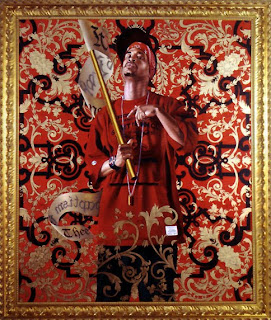
Post 4: Kehinde Wiley and Intertextuality

1. Find a clear definition of Intertextuality and quote it accurately on your blog using the APA referencing system. Use your own words to explain the definition more thoroughly. 

"The concept of intertextuality reminds us that each text exists in relation to others." (Daniel Chandler, 2003)

As quoted above by Chandler, the idea of intertextuality is about how different texts are influenced and referenced insight of others. It is about the shaping of texts' meanings by other existing texts. Everything that has become in the text was drawn and sourced from previous material read by the reader. 

2. Research Wiley's work and write a paragraph that analyzes how we might make sense of his work. Identify intertextuality in Wiley's work. 


'Untitled' (2009)

Kehinde Wiley was born in the late 70s and is now a well known portrait painter based in New York. His works are very naturalistic, usually portraying urban African men in a contemporary style. Taking men from around the streets of the city and where he lives, renders the models using realistic modes, usually painting them in heroic poses. His works often blur the boundaries between traditional and contemporary representation. Intertextuality is clear in his work as he is constantly referencing well known 17th and 18th century paintings which usually include strong figures from history. For example, Wileys work 'Napoleon Leading the Army over the Alps'' (2005) below directly refers back to the painting 'Napoleon Crossing the Alps' (1800) which was done by Jacques Louis David.


'Napoleon Leading the Army over the Alps'' (2005)

3. Wiley's work relates to next weeks Postmodern theme "PLURALISM" . Read page 51 and discuss how the work relates to this theme.

The postmodernist idea 'Pluralism' relates directly to most, if not all of Wiley's works. Wiley depicts African men with urban attributes such as street clothing etc, and places them in environments where you would usually expect a middle class white man to be depicted. You would expect this because in the past it has only been acceptable to paint white middle class people in the prioritizing places. Nowadays people are moving away from that absurd point of view and are including more varieties of cultural groups, less focus is on single ones.

''Count Potocki'' 2008

4. Comment on how Wiley's work raises questions around social/cultural hierarchies , colonization, globalisation, stereotypes and the politics which govern a western worldview. 

As Wiley grew from painting from photographic portraits of people from his city, his style started to question colonization and politics. Replacing what would usually be a middle class white person, with an African man, he has outlined and described previous problems that are amongst society. He is showing that the different social/cultural hierarchies within our races are all as important as each. I think he has done well to depicted the fact the black people have gained more acceptance into todays society, and that they should no longer be seen as anything less that any other culture. 

5. Add some reflective comments of your own, which may add more information that
you have read during your research.

I think that Wiley's work do a lot for our society in more than one way. His strong beliefs and thoughts are shown well with his referencing, media choices, and his contemporary style. Being someone from a country where racism and exploitation has always been a big issue, his work is very inspiring and paints interesting, deep thoughts in the viewers mind. 


en.wikipedia.org/wiki/Kehinde_Wiley
www.artnet.com/awc/kehinde-wiley 
www.thinkcontra.com/kehinde-wiley-on-current
www.robertsandtilton.com/artists/wiley

ALVC Handbook


Wednesday 22 August 2012

Post 3: Hussein Chalayan and Postmodern Fashion


1. Chalayan’s works in clothing, like Afterwords (2000) and Burka (1996) , are often challenging to both the viewer and the wearer. What are your personal responses to these works? Are Afterwords and Burka fashion, or are they art? What is the difference?


Hussein Chalayan is a British/Turkish Cypriot fashion designer born in 1970. 'Burka' and 'Afterwords' are two works that would definitely stir large amounts of discussion within the fashion community. The work from the series 'Afterwords' was inspired by the stories of refugees, having to leave their homes in times of trouble. The dress worn by the model was once a table made from circular rings. She steps into the table pulling up the rings, transforming the piece of furniture into a piece of clothing. This transformation suggests the necessity to leave home in a hurry with nothing but your clothes on your back. I think the work is obscure to look at and very hard to see past as an image. If seen as the filmstrip like I did afterwards, your understanding is easier to come by and the meaning and decisions behind the design surface much faster. When looking at it as an image you can see it suggests industrial ideas from the modernest of modern worlds. I think it is clever and the outcome of the pieces was very successful for Chalayan. 

'Afterwords' (2000)

The piece 'Burka' when first seen looks relatively disturbing, looking through the images they would create endless controversy for critics and audiences. This work, to me is definitely crossing the line between fashion and art. The works challenge ideas like modesty, feminity and identity with some models wearing nothing but masks and sandals. To me the work definitely challenges the identity of the female. It looks like he is showing women to all appear to look the same, no matter what the mask is like. 

'Burka' (1996)

I believe 'Afterwords' as a work would be classed as a fashion piece. However 'Burka', I think this work continuously crosses the line between fashion and art. It could be classed as both on many levels. I think fashion should head more towards being something that a person would literally wear, but it seems to be moving further from that. A quote about the difference between art and fashion "Fashion is what seems beautiful now but looks ugly later; art can be ugly at first but it becomes beautiful later." - Mona Simpson. As a piece of work, 'Burka' seems pretty ugly to me.

2. Chalayan has strong links to industry. Pieces like The Level Tunnel (2006) and Repose(2006) are made in collaboration with, and paid for by, commercial business; in these cases, a vodka company and a crystal manufacturer. How does this impact on the nature of Chalayan’s work? Does the meaning of art change when it is used to sell products? Is it still art?

'My work is about ideas. If I had to define my philosophy in just a few words, it would be about an exploration, a journey, and storytelling' - Hussein Chalayan. 

When the links between his works and industry are so strong, I think that to the art world his work would be classed less as art. It would be seen more as a money making exercise being performed. But to the people who try to understand his works meaning and what he has tried to accomplish, the would appreciated it further. Working with a client or a specific reason like advertising for a company would make his process a lot harder and longer.  The construction of the thought bubble behind would be twice as big as a normal work. Overall I think the impact wouldn't be noticed by Chalayan, an audience would look at the work with the thought in mind that 'it is a piece by Chalayan' not that it is a piece of advertising which is why I think he does it. 

 'The Level Tunnel' (2006)

'Repose' (2006)

3. Chalayan’s film Absent Presence screened at the 2005 Venice Biennale. It features the process of caring for worn clothes, and retrieving and analysing the traces of the wearer, in the form of DNA. This work has been influenced by many different art movements; can you think of some, and in what ways they might have inspired Chalayan’s approach?

'Absent Presence' film screened in Venice Biennale, 2005. It is based on genetics, biology and identityIt opens the argument on how certain identities can or cannot adapt to new environments. I think the film was highly influenced by Postmodernism, and of course a lot from the film industry with very realistic and blatant screenplay. He uses a lot of modern society elements such as DNA testing and other technology which shows the influence of the age we live in now. 


Photos from 'Absent Presence' (2005)

4. Many of Chalayan’s pieces are physically designed and constructed by someone else; for example, sculptor Lone Sigurdsson made some works from Chalayan’s Echoform(1999) and Before Minus Now (2000) fashion ranges. In fashion design this is standard practice, but in art it remains unexpected. Work by artists such as Jackson Pollock hold their value in the fact that he personally made the painting. Contrastingly, Andy Warhol’s pop art was largely produced in a New York collective called The Factory, and many of his silk-screened works were produced by assistants. Contemporarily, Damien Hirst doesn’t personally build his vitrines or preserve the sharks himself. So when and why is it important that the artist personally made the piece?

I think it is important for an artist to play a lead role in all aspects of their work, including the production. I believe it gives works much more value, having assistants doing bigger portions than the artist should under/decrease values. If an artist did none of the production, they would be getting constantly judged and phrased for talents that they don't have/didn't do. For example, audiences interested in hands on detail elements could be amazed by parts of a work, giving an artist a high place in their standards when infact that wasn't even their talent in play. To me it definitely completes a work, having the artist playing a lead roll in the production. 


http://usedmagazine.co.uk/?p=1542
http://fashion.telegraph.co.uk/galleries/TMG8459042/1/In-pictures-Hussein-Chalayan.html
http://art100.wikispaces.com/Hussein+Chalayan
http://www.husseinchalayan.com/blog/ 
http://www.designboom.com/eng/interview/chalayan.html 

Monday 20 August 2012

Post 2: Post Modernism - Ai Weiwei & Bansky

1. Define Post-Modernism using bullet points that include short quotes.
It is a tendency in contemporary culture characterized by the rejection of objective truth and global cultural narrative.
Postmodernism is "post" because it is denies the existence of any ultimate principles
- It is associated with relativism, "anything goes".
- Linguistic idealism, as in "reality does no determine language, language determines reality".
- Irony
- Pluralist
Reflexivity
- Non-universalist people, as in people choose what the want to believe. "Nothing is guiding society's way of thinking".

2. Use a quote by Witcombe (2000) to define the Post-Modern artist.
"The post-modern artist is ''reflective" in that he/she is self-aware and consciously involved in a process of thinking about him/herself and society in a deconstructive manner, "demasking" pretensions, becoming aware of his/her cultural self in history, and accelerating the process of self-consciousness."

3. Use the table on pages 47 and 48 in your ALVC handbook to summarize the list of the features of Post-Modernity.
Postmodernity follows an unclear bases or cultural pluralism where there single road/belief that everyone admits to. The depth of an image is without concern, with more attention being played to the surface of images. It forms a new culture mixing both high and low categories instead of one reigning over the other. It is continuously adapting to visualized media, substituting it for the real. It challenges seriousness, forgetting boundaries which become lost. Brings much more freedom to art, with it being judged and authenticated by an audience made of up everyday people.

4. Research Chinese artist Ai Weiwei's 'Han Dynasty Urn with Coca-Cola logo'(1994)
in order to say what features of the work could be considered Post-Modern.


There is a few features within this work by Ai Weiwei that could be considered 'Postmodern'. Firstly the main feature would be the mixture of two different cultures, mixing an ancient cultural artifact found most commonly in the eastern world with one a well known logo from Coke. The coke logo is one of the biggest known brands of modern society in the western world so you could also say he is blending the western world with the eastern aswell. Another postmodernist feature could be irony as he has taken an ancient urn of high value, and by placing the Coke logo on it, turned it into a ugly, useless item with no longer any value at all. 

5. Research British artist Banksy's street art, and analyze the following two works by the artist to discuss how each work can be defined at Post-Modern.


This work 'Flower Riot' done by Banksy, is of a gangster or a rioter in street clothing, throwing a bundle of flowers. Irony has been used by replacing what would usually be a rock, or a bottle or something, with a bundle of flowers. Instead of the action from this ganster   resulting in violence it will result in peace. This comparison could be portaying a view that tries to remove the seriousness and uncomfort from society.


This work 'Los Angeles' produce by Banksy, is of a caveman carrying a tray of fast food. Here he is again playing with irony which is one of the main postmodern features. A caveman is an early/pre man dating back thousands of years, who is carrying fast food which is one of the modern worlds most used inventions. He could be using this feature to show the slackness of our society today, and how as we advance through the ages, our laziness grows with us. Another feature that could be seen here is the comparison of cultures, comparing ancient pre historic culture of cavemen/neanderthals, with the modern fast food meal which is seen almost everywhere you go in todays society. 


en.wikipedia.org/wiki/Postmodernism
www.spaceandmotion.com/Philosophy-Postmodernism.htm
www.galilean-library.org 
http://www.allaboutphilosophy.org/postmodernism.htm
aiweiwei.com/
http://en.wikipedia.org/wiki/Ai_Weiwei
maryboonegallery.com/artist_info/pages/ai/detail1.html
www.banksy.co.uk/

Monday 23 July 2012

Post 1: Nathalie Djurberg's 'Claymations'

1. My understanding of the word 'claymation'.
I understand 'claymation' to mean the animation process which incorporates clay models or figurines. The models are manipulated and filmed to produce an image of lifelike movement, usually by a method called stop-motion photography. Each frame, the figurines would be repositioned just slightly so that when the film streamed, the animation would come to life.

2. What is meant by the term 'surrealistic Garden of Eden'? and 'all that is natural goes awry'?

The term 'surrealistic' refers to something that isn't real/unrealistic, like a dreamscape for example, or a distorted/manipulated image. The 'Garden of Eden' in biblical terms was referred to 'paradise', or 'the Garden of God'. It was the place where God put Adam and Eve, the first two human beings. These words 'surrealistic Garden of Eden' refer to the Garden that Djurberg has created. It explains how twisted, distorted and unrealistic her Garden of Eden looks. We usually see gardens to be peaceful, relaxing places but hers is quite the opposite, which is why it is described as 'surreal'.

The words 'all that is natural goes awry' is a link between nature or the living and 'wrong/unpredicted'. The word awry means 'to twist away from the correct course'. Considering Djurbergs works are about sadism and the darker side of the human soul, the words together could mean that nature and all that is living will always astray from the proposed path, sometimes for the worst leading towards death or other negative outcomes.


3. What are the 'complexity of emotions' that Djurberg confronts us with?
When viewing Djurberg's work our emotions get intensely mixed and thrown around. Our imagination is constantly at play, being mixed with scary, horrific emotions and also feelings of happiness and excitement at times. The weirdest of the feelings is that of surprise and unexpectancy, how you are unsure of how to feel half the time, not knowing what is supposed of you. 

4. How does Djurberg play with the ideas of children's stories, and innocence in some of her work?

In a common children's story or tale, the characters are usually first faced with a dark situation and then everything turns happy ever after at the end. Djurberg plays with this idea, reversing the story line, with the happy situations at the start and ending with the dark, horrible situations. She still incorporates ideas of fantasy from children's stories, such as colorfulness and unrealistic features and design. She also still includes the idea of innocence in her work, but not making it as wondrous as in children's books. Making it more of a 'useless' innocence, about how the children are as dark and monstrous as the adults.


5. There is a current fascination by some designers with turning the innocent and sweet into something disturbing. Why do you think this has come about?
I think the nowaday designers and visualists are branching out further, still trying to capture those not seen before ideas, trying to set themselves apart from everyone else. It could be their view of the next step, as we have had our time of the happily ever after tales and need something that excites us in a new way. They could also be using this as a method to show their views on what has happened to society and trying to give the new generation insight into the new disturbing world, trying to rule out all of the fake stuff that is becoming more and more distant.

6. In your opinion, why do you think Djurberg's work is so interesting that it was chosen for the Venice Biennale?

I think it was chosen because it has a dramatic style and difference from the norm. How she has captured the reality of situations in the world, mixing the innocent with dark, terrible situations has created impact. Also how your emotions are twisted and warped when you are viewing, it definitely helps you make more connections with everything that is going on. One of the most contributing factors I think would have been her style and her decisions throughout her process of making. The claymation method and the work behind her modeling has definitely given her work an independent edge, separating it from others and helping her success.

7. Add some of your own personal comments on her work. 

I find her surrealistic style always interesting to explore. The mixture of fantasy design and colourful vs dark sets with her story lines, and also her audio choices aswell, the way she has brought everything together definitely keeps me intrigued. An idea that stands out to me, is how she has reversed the fantasy tales story line from being a happy ending to a dark ending. From this she could be symbolizing how us as humans have almost come to far for there to be any happiness at the end. If this was infact the case I think the new generation will have a more realistic view of life. 


http://en.wikipedia.org/wiki/Garden_of_Edenhttp://www.thefreedictionary.com/awryhttp://artnews.org/artist.php?i=1211http://www.trendhunter.com/trends/nathalie-djurberg#!/photos/47242/1http://en.wikipedia.org/wiki/Nathalie_Djurberghttp://www.designboom.com/weblog/cat/10/view/6886/nathalie-djurberg-experiment-at-venice-art-biennale-09.htmlhttp://londonscrawling.wordpress.com/tag/claymation/http://we-make-money-not-art.com/archives/2009/10/nathalie-djurberg-who-won-the.php

Sunday 27 May 2012

Post 5: Industrialisation


1. What and when was the Industrial Revolution?
The Industrial Revolution was a period in Europe's history where the discovery of rock, minerals and other materials conjured massive change in manufactural industries. The invention of machinery and enginery meant that the industries could produce development more efficiently and more importantly, faster. This changed the way people lived and has continually brought change to the world ever since. It started in the late 18th century in Britain and near European countries before spreading to the western region of Europe. 

Both paintings featured on this blog, that are from the early 1900s were painted by Modernist painters from the group called 'Futurists'. The Futurists celebrated the machine, and objects in motion. Their primary objective was to depict movement, which they saw as symbolic of their commitment to the dynamic forward thrust of the 20th century.

2. Research both Modernist paintings in order to comment on the subject matter, form and style used to celebrate the machine and motion in each painting. 

'The City Rises' by Umberto Boccioni, 1910.


The main subject matter seen in this work are the horses, the contruction workers, and the construction site in the background. The horses look distressed and in motion as if they are afraid or being startled, and its like the men are trying to do their best to get the horses under control. The style of the painting and palette reflects motion and movement. The quick, somewhat messy and abstract brushwork with the blurring methods help to portray the movement and the fast paced action and development happening around them.


'Dynamism of a Dog on a Leash' by Giacomo Balla, 1912.


In this work by Balla, the subject matter is alot simpler, consisting of only a woman walking her dog through some sort of undetailed terrain. I would have suggested that they are walking relatively fast as of the blurring of the feet. Both the dog and the owner have their feet blurred with repetitions of them in a motion line to show movement. Also the brushwork on the terrain which could very well be a street or just some dirt, creates a blur which also portrays motion, helping show that the subjects are moving at a fast pace. One idea I could see happening would be the low angle of vision, this view makes you feel smaller. This could link to the industrial revolution and how everything is developing at such a fast pace, a small single being such as myself could never have any impact on changing it from taking over everything.

3. Research Cao Fei's RMB City (2007-9)  in order to comment on this work in more depth.
RMB City is a virtual city that Cao Fei created using distinctive imagery from a wide range of Chinas characteristics. It reflects the fluidity of a world in which cultures have mixed and diverged in rapid evolution. The 3D city, named after chinese money, shows a preserve view of Beijing, a blend of communism, socialism and capitalism. She has used images such as a giant shopping cart, filled with skyscrapers and religious moments which is floating in the sea. Candy striped smoke stacks, suggesting the continuous industrial production which is Beijing. There are ships moving in and out of the port which relates directly back to Tianjin Xingang Ports in Beijing. She has also used the famous Tiananmen Square except turning it into a big swimming pool. The reason for her design decisions is because she wanted to create something that responds directly to China's rapid urbanization and the pace of social and economic development.


4. RMB City is described as a utopia/dystopia. Comment on what these terms mean, and how they can be applied to the work.
Utopia refers to paradise alike, or an idealized place or society. Dystopia refers to the complete opposite, meaning an unwanted society or an imaginary place in which the condition of life is extremely bad. I suppose they could both relate to the work in the way that China used to be this 'Utopia' a place of paradise, where everything was nice and perfect. And now it has resulting or heading for the opposide end which is 'Dystopia'. The two are sort of represented in the work as the bright and lively colour representing the Utopia that used to be and the context or everything else showing the Dystopia that the place is now. 


5. Comment on the similarites that you can see in the Modernist paintings and the contemporary digital work that has emerged. 
The main similarity that is present in the three works below is the use of the world they are living in as an idea. They are all in a way, celebrating industrialism or criticizing the effect that it has had on the world we are living in. Another similarity that is evident is the idea of motion or movement. This is clear in Fei's work with the smoke coming out of the pipes, the boats coming in and out of the ports, and also the cars moving to and from. There is evidence of motion and speed in the other works from the use of painting techniques such as the blurriness surrounding the dog. 


http://www.britannica.com/EBchecked/topic/287086/Industrial-Revolution
http://www.investopedia.com/terms/i/industrial-revolution.asp#axzz1w8hZQKnE
http://www.scoop.co.nz/stories/CU0906/S00212.htm
http://www.vimeo.com/4272260